

Web Content Accessibility Guidelines (WCAG)
The Web Content Accessibility Guidelines (WCAG) are a set of rules created by the World Wide Web Consortium (W3C) to help make websites accessible to people with disabilities. The guidelines are updated over time, with the latest being WCAG 2.1 and WCAG 2.2. These guidelines are based on four main principles
1. Perceivable
What it means: Users need to be able to perceive the content on your website.
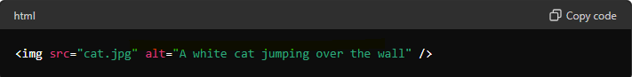
Example: Add alt text to images so that screen readers can describe them to visually impaired users. If you have a picture of a sunset, the alt text might say, “A beautiful sunset with orange and pink hues.”
2. Operable
What it means:
Users should be able to operate and navigate your website using different methods.
Example: Ensure that all parts of your website can be accessed using a keyboard alone. For instance, users should be able to use the “Tab” key to move through links and buttons without needing a mouse.
3. Understandable
What it means: Content descriptions and interfaces should be easy to understand, involving clear language and logical structures.
Example: Use simple and clear language. Instead of saying “utilize,” you can say “use.” Also, keep your website layout consistent across all pages to avoid confusion. For example, if the navigation menu is at the top of the homepage, it should be in the same place on all other pages.
4. Robust
What it means: Your website should work with current and future technologies, including assistive tools.
Example: Use proper HTML coding practices to ensure that screen readers and other assistive devices can interpret your content correctly. This means using tags and elements in the way they are intended.
Example Scenario
Imagine you have a website for an online store. Here’s how you can apply these principles:
1. Perceivable : Add alt text to images of products so screen readers can describe them.
2. Operable : Make sure users can add items to their cart using a keyboard.
3. Understandable: Use clear language for product descriptions and instructions.
4. Robust : Ensure the website’s code follows standards so it works with various assistive technologies.
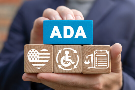
Americans with Disabilities Act (ADA):
The ADA, or Americans with Disabilities Act, is not directly a web accessibility standard. It’s a civil rights law in the United States enacted in 1990 that prohibits discrimination against individuals with disabilities.
While the ADA doesn’t outline specific technical requirements for web accessibility, it emphasizes equal access for people with disabilities. This has led to a strong connection between the ADA and the internationally recognized Web Content Accessibility Guidelines (WCAG).
ADA Website: https://www.ada.gov
Levels of Conformance
WCAG guidelines come with different levels of conformance:
1. Level A: The most basic web accessibility features that must be met.
2. Level AA: Level AA conformance is adding more advanced aspects of accessibility. Level AA builds upon the Level A guidelines. Some of these Level AA success criteria features include captions for videos, allowing dark mode or color-blind mode for readability, and making sure all areas can be interacted with keyboard inputs.
3. Level AAA: The highest and most complex level of accessibility,and possible to meet all levels of accessibility.
Meeting Level A is the minimum requirement, Level AA is a good standard for most websites, and Level AAA is the most thorough but can be difficult to achieve for all content.
Specific Accessibility Practices
- Alternative Text for Images
Images should have alt text to describe their content for screen readers.

- Keyboard Navigation
All functionality should be accessible via keyboard.
- Semantic HTML Tags
Use <em> or <i> for italics, <strong> or <b> for bold, <s> for strikethrough(deleted) text etc..
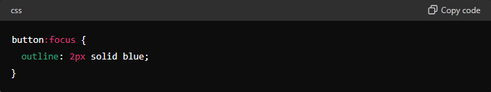
- Visible Keyboard Focus
Ensure keyboard focus is clearly visible.
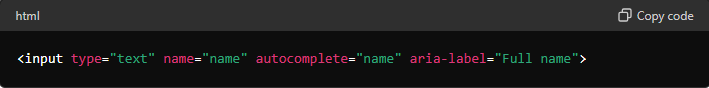
- Avoid Redundant Form Entries
Provide autocomplete options for form fields. Autocomplete allows the browser to predict the value so that users do not have to enter the same information multiple times. .
- Present Content Meaningfully
Ensure content is logically organized and meaningful.For example
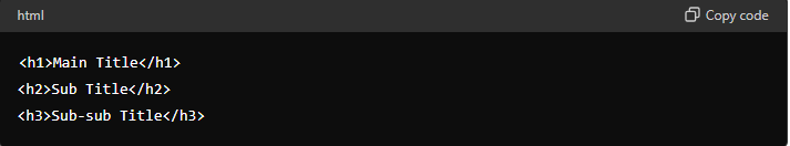
Headings and Subheadings: Use headings (<h1> to <h6>) to structure your content hierarchically.
<h1>: Main title of the page (should be used once per page).
<h2>: Section titles.
<h3>: Subsection titles, and so on.
- Responsive Design
Websites should adapt to both portrait and landscape modes.
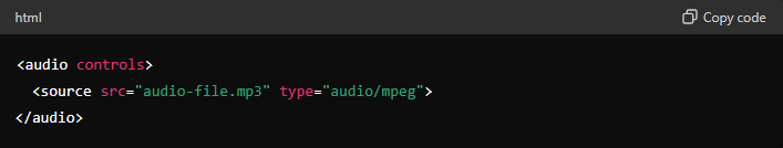
- Control Audio Playback
Do not play audio automatically; provide controls.
- Avoid Images of Text
Use text instead of images of text.
- Exclude decorative figures from Screen Readers
Use role=”none” for decorative figures
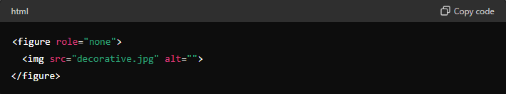
You can also use role=”presentation” as an alternative to role=”none”, and it will have the same effect.
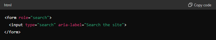
- Tag Search Fields
Use role=”search” for search forms.
- Single H1 Tag per Page
Each page should have exactly one <h1> tag. This helps screen readers and search engines understand the primary topic of the page.
- Consistent Title Hierarchy
Follow a logical heading structure
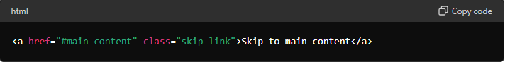
- Skip to Content Links
Provide a link to skip repetitive content.
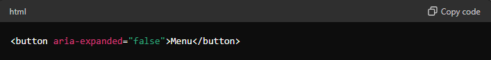
- Dropdown States
Represent dropdown states in the code.
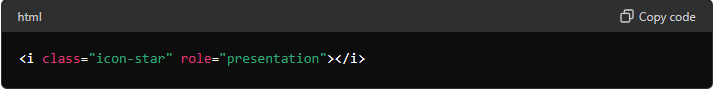
- Tag Non-functional Icons
Use role=”presentation” for decorative icons.
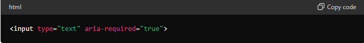
- Required Fields
Indicate required fields with aria-required.
- aria-label (text)
The aria-label attribute is a crucial tool for making web content accessible by providing descriptive text for elements that lack visible labels. It helps ensure that all users, including those who rely on assistive technologies, have a clear understanding of the purpose and function of interactive elements on a webpage.
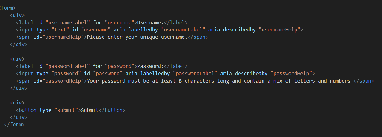
- Label Input Fields
Use aria-labelledby and aria-describedby for input fields.
- Sufficient Font Sizes
Ensure font sizes are at least 11px.
- Sufficient Contrast
Ensure text has enough contrast with the background.
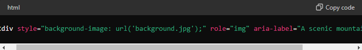
- Background Images as Foreground
Use role=”img”and aria-label must be provided for background images used as content.
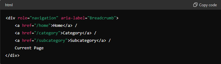
- Breadcrumbs should be labeled
Use role=”navigation” and aria-label as description to the functionality.
- Descriptive Deleted Texts
Describe deleted text with aria-label.

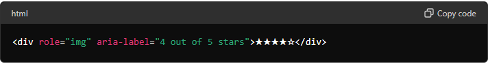
- Labeled Star Ratings
Use aria-label to describe star ratings.
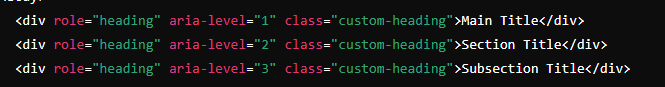
- Use role=heading for custom title elements
Custom tag as title should have a role=”heading” and level={1 – 6} explain with example
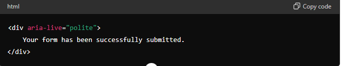
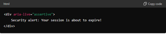
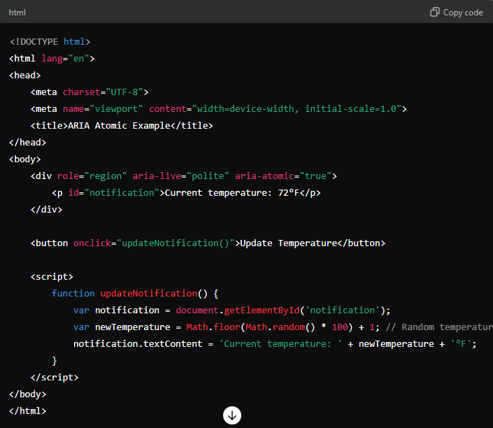
- Understanding aria-live Attribute
The aria-live attribute is used in web development to make sure that updates or changes on a webpage are communicated to users who rely on screen readers. This attribute is particularly useful for dynamic content that updates without a page reload, like notifications, chat messages, or updates in an online form.
aria-live Values and Their Meanings
1.polite
Meaning: The content of this region will be announced by the screen reader but only when the user is not interacting with something else.
Example: You have a form on your page that gives validation messages when users fill it out. These messages should be read out when the user pauses
2.Assertive
Meaning: The content of this region will be announced immediately by the screen reader, interrupting whatever the user is currently doing.
Example: You have an urgent notification, like a security alert, that needs to be communicated to the user right away
3.off
Meaning: The content of this region will not be announced by the screen reader unless the user navigates to it.
- aria-atomic
It tells screen readers whether to announce the entire content of an element when it changes or just the updated part.
The aria-atomic attribute has two possible values:
1. true: The entire region will be presented to the user whenever any part of it changes.
2. false: Only the changed parts of the region will be presented to the user
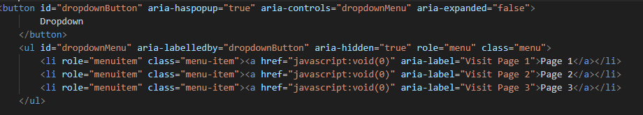
- Menu and menu items should be labeled accordingly.
Use role=”menu” and aria-labelledby (toggle button id) for menu and role=”menuitem” foreach item. aria-controls (menu id) and aria-expanded (boolean) for toggle button.
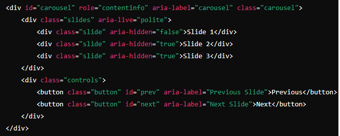
- Carousels should be labeled accordingly and presented as a landmark
Use role=”contentinfo” and aria-label should be equal to “carousel”/”slider” or describe the functionality.
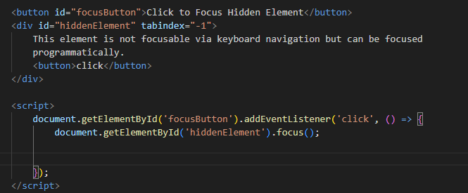
- tabindex (number)
Makes the link focusable via keyboard navigation.Elements with a positive tabindex value are focused first in ascending order. Elements with the same tabindex value are focused according to their position in the document.
By default elements are having tabindex 0.
-1 (e.g., tabindex=”-1″): Elements with a tabindex=”-1″ value can be focused programmatically but are not part of the default tab order. This is commonly used to make elements focusable via scripting without affecting the overall tab order.
- role (link | button | presentation | none)
Specifies the behavior of the element.
The role attribute in HTML is used to define the purpose or type of an element for accessibility and assistive technologies. There are various values that can be assigned to the role attribute to indicate the predefined roles that certain elements play in a web page. Some common values for the role attribute include:
button: Indicates that the element functions as a button and can be activated by the user.
link: Specifies that the element functions as a hyperlink and can be selected to navigate to a different resource.
heading: Designates the element as a heading, providing structure and hierarchy to the content.
listbox: Indicates that the element is a container for a list of options that can be selected.
menu: Specifies that the element functions as a menu, providing options for the user to choose from.
search: Designates the element as a search input field, allowing users to enter search queries.
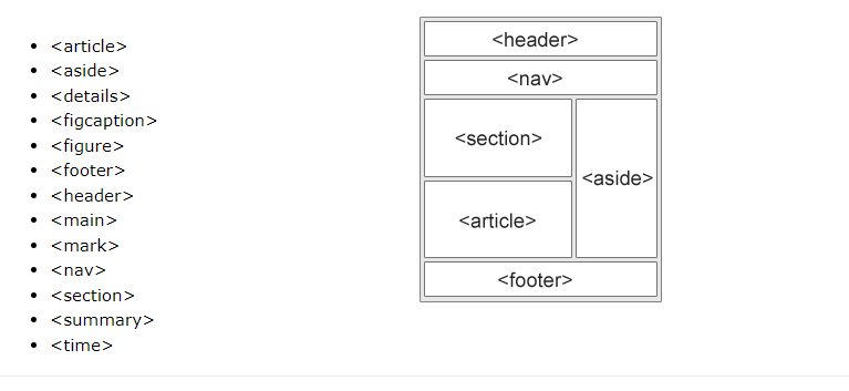
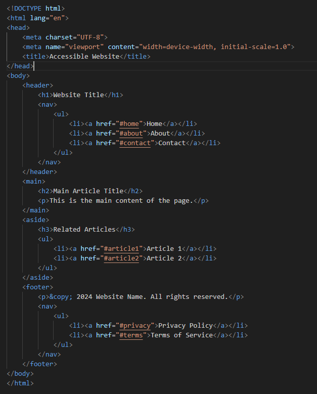
- Proper Landmarks in Web Pages
In web design, landmarks are important for creating accessible websites. They help users, especially those using screen readers, navigate and understand the structure of a webpage. Proper landmarks improve the usability of a site by clearly defining sections like headers, navigation, main content, and footers.
- Flashing Content
Limit flashing content to three flashes per second to prevent seizures.People who have photosensitive epilepsy are particularly vulnerable to flashing content.
- Tools Used:
Screen reader – NVDA, Narrator (Windows), VoiceOver(MacOS)
Scanner – Accessible
Flashing Test – PEAT
- Refer more:
W3C WCAG Overview:
https://www.w3.org/WAI/standards-guidelines/wcag/
- Google Document : https://docs.google.com/document/d/1tu0yC2Q5vtU_My__vemwf3WO7D2_eb9iYUJpEIWnFyA/edit
Top comments